
For Stockert, patients are always the priority! We combine our passion for technology with more than 30 years of experience in medical device design and a highly motivated team of experts, to improve the quality of life of millions of patients and physicians around the world.  Our name stands for advanced technology and high quality. For us, there are no compromises when it comes to patient safety and customer satisfaction.

From Freiburg to the world. In spite our products being employed in 165 countries worldwide, we have managed to stay local and keep our traditional high standards and values. Together, we create high-tech medical devices “Designed-Developed-Made in Germany”.

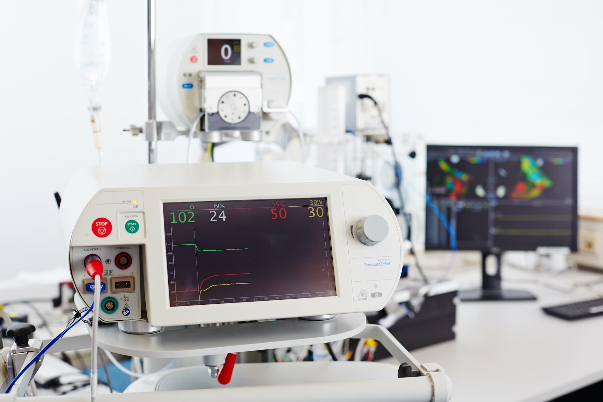
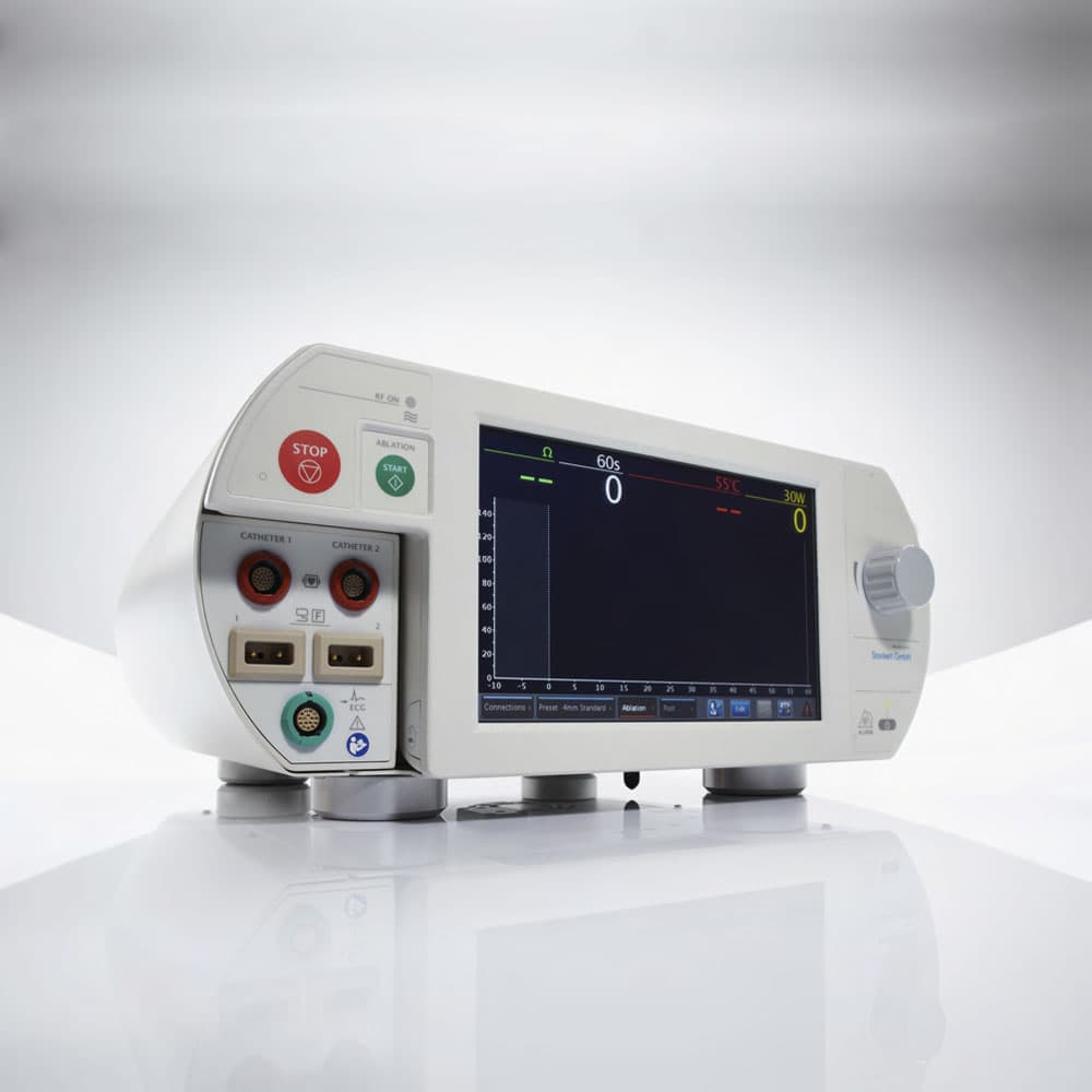
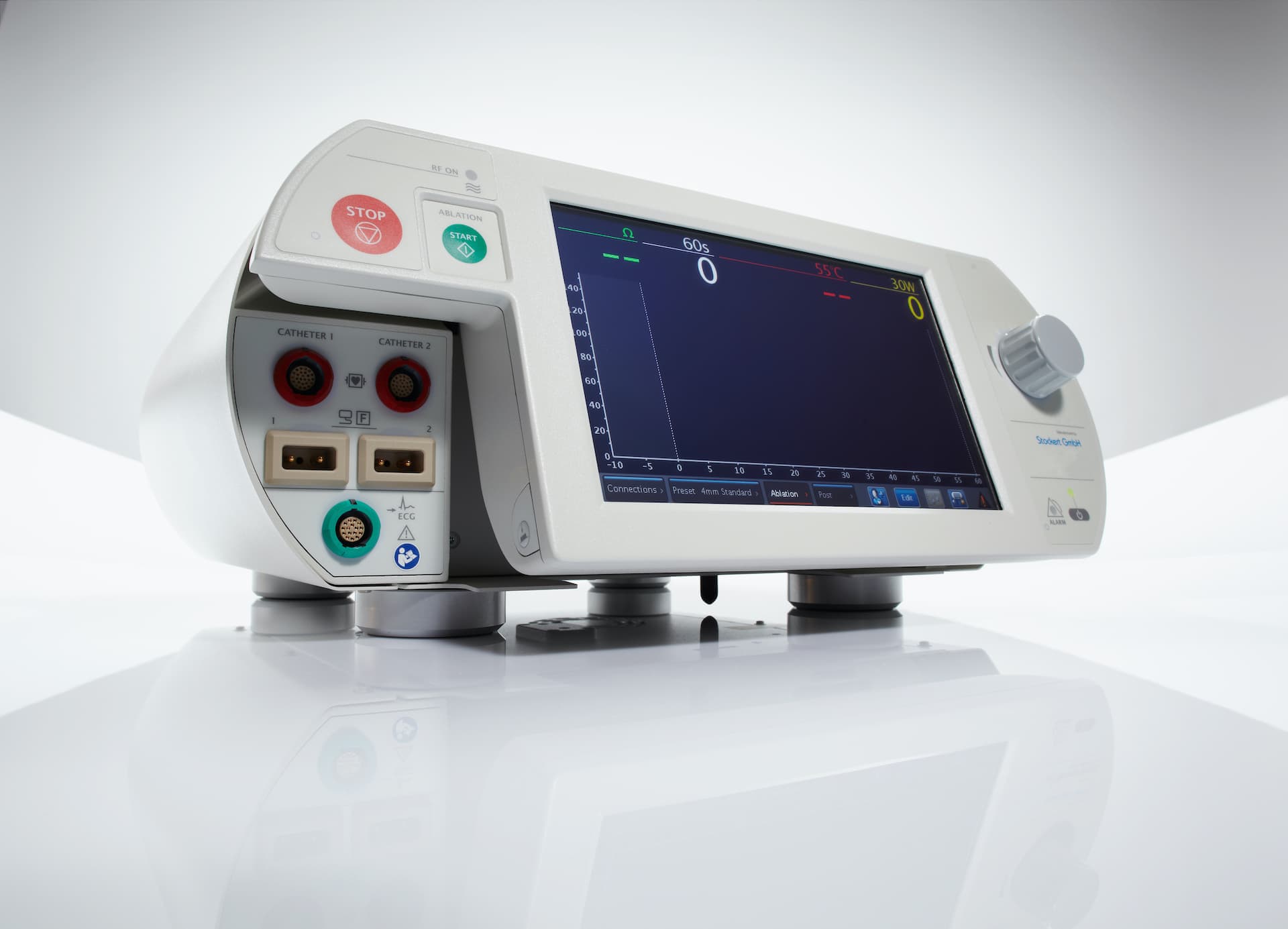
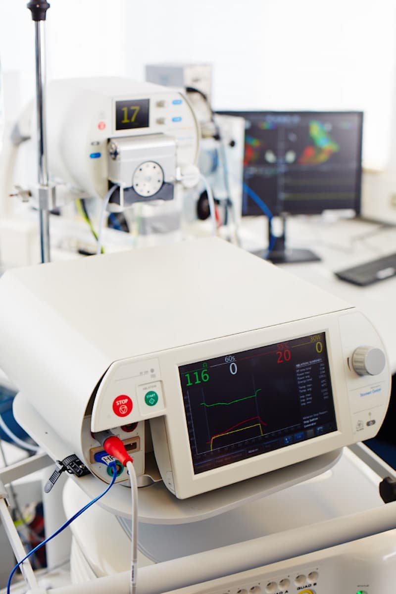
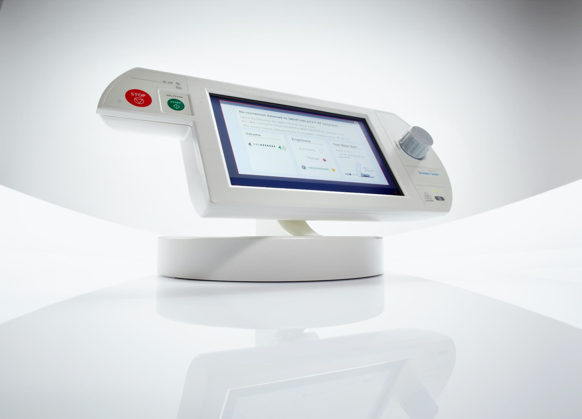
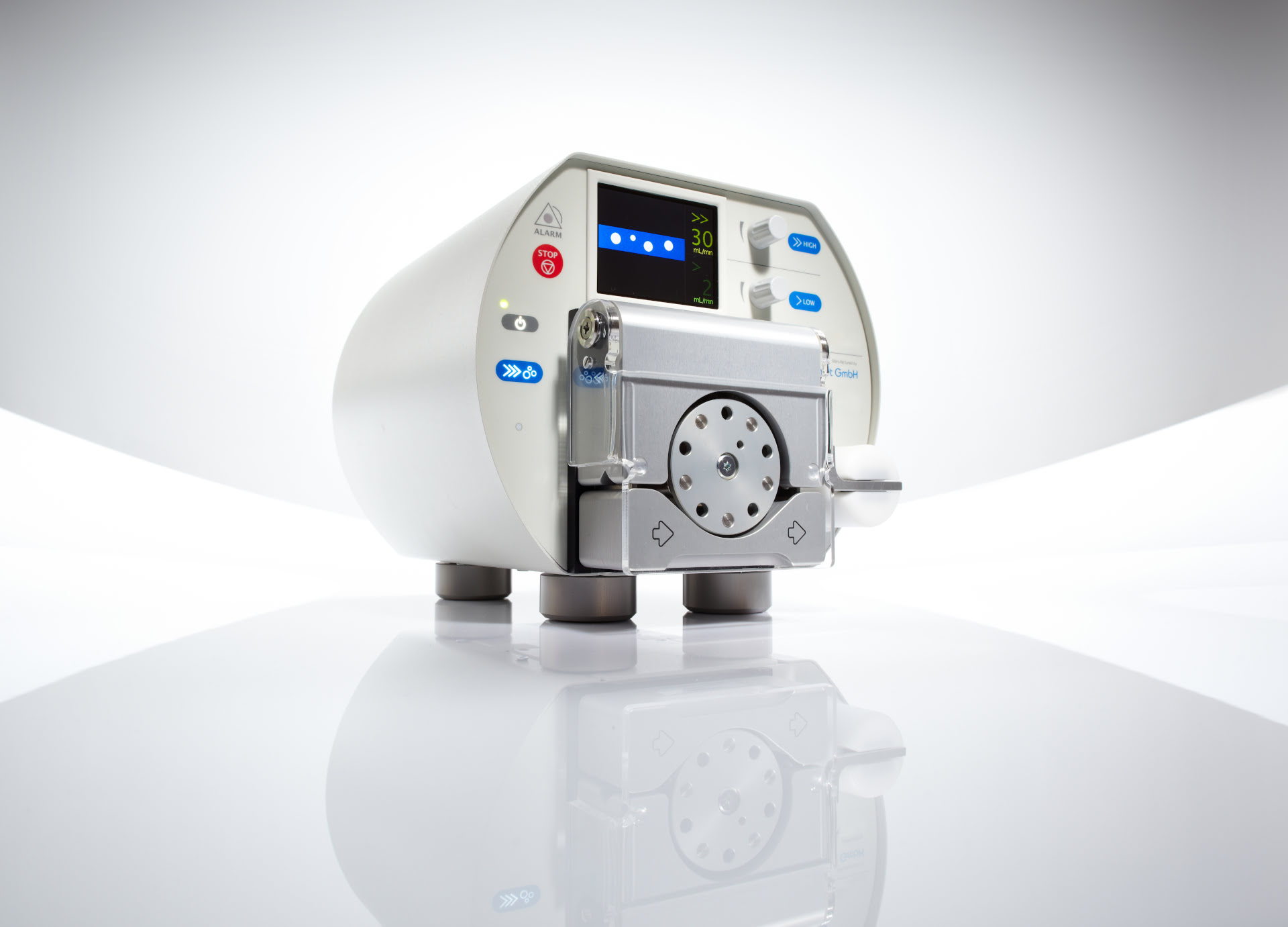
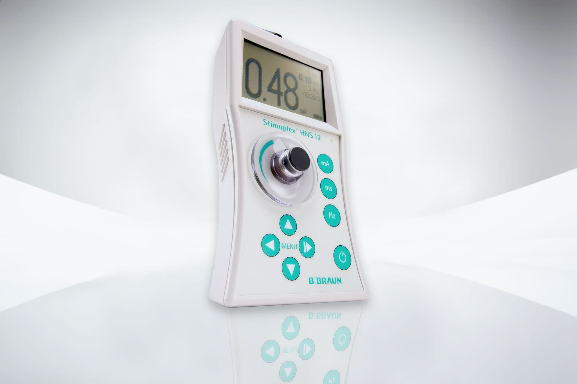
Our focus lies on minimally invasive techniques in the departments of cardiology and nerve stimulation. We develop market leading systems that make us a recognizable and trusted partner.

This document provides a roadmap with suggestions regarding our key brand elements.

Let us begin at the beginning

We create a consistent brand identity. These guidelines have been designed to help create a professional, precise and consistent brand identity and design language for Stockert as a group, across all relevant brands, touchpoints and audiences.

You’ll be introduced to the very core visual components that, when combined, define and empower our brand.

This document continues to be a work in progress and will be updated and extended as things flux and grow. When you use or share these guidelines, please check if there’s a new version available.

For any questions, please contact: productmanagement@stockert.de

Favicon

A brand’s logo is a core element of its visual identity and one of its most valuable assets.

Our logo marks the evolution from our origins as medicine supplier to becoming a trustable company.

The logo should never be altered, distorted or re-created in any way.
Whichever logo you use, make sure to carefully follow the guidelines presented on the following chapters.

Heart Rate Visual

The Heart Rate Visual serves as a separator and is used as an underline under headings. The visual is available in blue and white.

The length of the line can be shortened or lengthened if necessary, but the “heartbeat” in the visual must remain unchanged.

Distinction between Stockert GmbH and Stockert

Our company name is written in two variations:

Stockert GmbH: The registered legal company name is used when referring to the parent company. This is generally the case in all corporate communications channels. The Stockert GmbH version is used for our letterhead contact details and all other body text such as press releases.

Stockert: This wording is used in other applications, other than corporate, when it doesn’t refer to the parent company directly.

Color palette

Color is an effective, powerful and instantly recognizable medium for visual communications.

Main blue

CMYK 87, 50, 0, 0
RGB 0, 110, 184
HEX #006eb8
PANTONE 20-0148 TPM
HSV 204, 100, 72
LAB 45, 2, -46

Gray

CMYK 56, 47, 45, 38
RGB 100, 99, 99
HEX #646363
PANTONE 20-0007 TPM
HSV 0, 1, 39
LAB 42, 0, 0

Dark blue

CMYK 100, 23, 25, 29
RGB 35, 40, 84
HEX #232854
PANTONE 20-0145 TPM
HSV 234, 58, 33
LAB 18, 12, -28

Light blue

CMYK 75, 34, 6, 0
RGB 59, 141, 195
HEX #3b8dc3
PANTONE 20-0145 TPM
HSV 204, 70, 76
LAB 56, -7, -35

Gradient 1

CMYK 87, 50, 0, 0
RGB 0, 110, 184
HEX #006eb8
PANTONE 20-0148 TPM
HSV 204, 100, 72
LAB 45, 2, -46

CMYK 100, 23, 25, 29
RGB 35, 40, 84
HEX #232854
PANTONE 20-0145 TPM
HSV 234, 58, 33
LAB 18, 12, -28

Gradient 2

CMYK 60, 0, 3, 0
RGB 93, 196, 237
HEX #5dc4ed
PANTONE 20-0154 TPM
HSV 197, 61, 93
LAB 75, -18, -29

CMYK 75, 34, 6, 0
RGB 59, 141, 195
HEX #3b8dc3
PANTONE 20-0145 TPM
HSV 204, 70, 76
LAB 56, -7, -35

The colors are already stored in Adobe Color and can be saved and used directly from here. View and use corporate colors on Adobe Color

The way typography is used says as much about a brand as the words themselves

Typography is an essential trigger to activate our brand voice.

Stockert’s primary typeface for printed and corporate digital/web communication is Century Gothic.

Additional typefaces are available.

Century Gothic

Aa


Century Gothic Bold

ABCDEFGHIJKLMNOPQRSTUVWXYZabcdefghijklmnopqrstuvwxyz0123456789!@’#%&.

Aa


Century Gothic Regular

ABCDEFGHIJKLMNOPQRSTUVWXYZabcdefghijklmnopqrstuvwxyz0123456789!@’#%&.

Aa


Century Gothic Italic

ABCDEFGHIJKLMNOPQRSTUVWXYZabcdefghijklmnopqrstuvwxyz0123456789!@’#%&.

Webfont Alternative: Zen Kaku Gothic New

For websites the web font Zen Kaku Gothic New can be used for free purpose. It is very similar to the Century Gothic font.

Tables can be used for a variety of things, like in letters, on websites and in presentations.

A suggested design can look like this:

RF output 4 x 25 W @ 480 kHz
Monopolar (1 to 4 channels) or bipolar (1 or 2 channel pairs) operation
Total patient output limited to 700 mA (=50W @100Ω)
RF operating modes Thermal RF
Pulsed RF
Staggered start
Stimulator output Motor 1-10 Hz (default 2 Hz)
Sensory 20-200 Hz (default 50 Hz)
Stimulator operating modes Constant-current mode (0 mA to 10 mA)
Constant-voltage mode (0 V to 10 V)
Output current limited to 10 mA
Connectors 4 x 10-pin RF instrument connectors
1 x ValleyLab Indifferent electrode connector
1 x USB for data export & preset exchange
Ethernet (disabled, future option)
Monitoring Temperature: 5°C to 120°C
Impedance: 2 Ω to 2000 Ω @ 480 kHz
Indifferent Electrode Contact Quality Monitoring

Background image (optional): https://www.stockert.de/wp-content/uploads/human-heart-system-bw.jpg

Presentations

The template for company presentations can be found on out Intranet page

Presentations

The template for company presentations can be found on the company Intranet

Imagery

An image is worth a thousand words. To be a magnetic brand, the imagery we use should balance between aspiration and identification. This is rooted in our place in MedTech and extends to all that are in touch with the brand — from customers, business partners, investors to employees. The following attributes apply also to moving image (video).

  • Fresh & positive attitude: Creating an emotional quality that feels fresh and positive
  • Dynamic & energetic perspective: Exploring different perspectives to keep it dynamic and energetic
  • Natural & authentic moments: Combining natural light and character to capture authenticity and trustworthyness
  • Simple & approachable: Keeping things simple and approachable to all

Photography

Show only part of a person, or environment. Avoid at all cases standing and posing photos with people looking at camera, or with forced facial expressions. Introduce a normality and resemblance of a normal day. Put the viewer off balance and create a spark, don’t offer them everything on the plate. Keep clear of frontal product images and work with edges to highlight the design and technology. Include close ups of key features on the exterior. Avoid the use of gradients. Product can be placed either on a solid colour background or clipped out and placed on white —without a colour background. May contain drop shadow.

If you are interested, we will provide suitable image material. Contact us directly by email at productmanagement@stockert.de.

If you need visuals, you can find them here:

H:\_Stockert_global\10_Vorlagen

Stock Photography

Careful selection and focus on looking authentic. Environments should appear true and not unrealistic. The colour palette should match that of Stockert GmbH. The photography guidelines also stand for the stock photography.

If you are interested, we will provide suitable image material. Contact us directly by email at productmanagement@stockert.de.

Photography requirements

Ensure that the file name is associated with Stockert. File name should start with the word “Stockert” and continue with the product name or department followed by a unique number (e.g. Stockert_Firma_00453, Stockert_SMA_15987).

Blue overlay

We use a blue overlay over background images to force our CI. The blue background should be colored in our main blue color with a opacity by 80%.

Main blue

CMYK 100, 80, 0, 60
RGB 0, 25, 87
HEX 001957
PANTONE 2766 C, 2757 U
RAL 5022

Background image with blue overlay.

Image border radius

If you use images please use them with a border radius of 10 pixels. Smaller images (300 pixels width and smaller) can also have a border radius with 5 pixels.

Large image with 10 pixels border radius.

Small image with 5 pixels border radius.

Imagery that tells our story

Imagery, whether illustrative or photographic, is one of the most critical assets in a brand identity system. It has the power to draw in our audience while expressing our distinctive personality.

Our imagery should be memorable and recognizable that it is Stockert from a single instance, even without the help of accompanying assets and the media environment.

An image’s look and feel is the culmination of visual elements that include light, color, contrast, sharpness, composition, perspective and photographic techniques, as well as the representation of subjects such as people, spaces and tools.

Questions

This document continues to be a work in progress and will be updated and extended as things flux and grow. When you use or share these guidelines, please check if there’s a new version available.

For any questions, please contact: productmanagement@stockert.de